
Rice to Riches
Wid Chapman Architects
Agency: Wid Chapman Architects
Client: Rice to Riches
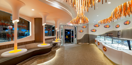
Inspired by the shape of rice grains, as well as the consistency of creamy pudding, the firm created a curvaceous retail and eating environment. Walls are layered with a continuous form that undulates up and down around the space. This forward-protruding plane houses 36 oval shape LED screens with constantly moving images and witty verbal quips about consuming rice pudding- a brand hallmark of the previous store. The pudding retail display case has a similar vocabulary, as do the ceilings with their irregular-shaped lighting recesses. These recesses in turn contain thousands of opaque and translucent acrylic rods of varying lengths and colors which serves to animate the ceiling and the entire place. A playful, wavy banquette wraps the entire storefront wall with oval storefront windows above. Along the banquette are tables which suspend from the ceiling from posts that appear to grow from conal forms on the ceiling. Picking up on the orange accent theme throughout, these tables contain an orange back lit ring of acrylic.