
Red Dot Design Museum · Xiamen
STEPS Architecture
Agency: Wu Yu
Client: Red Dot Design Museum
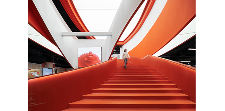
To achieve the continuous wandering experience that we learn from shopping malls, we try to blur the boundaries between exhibition halls and other spaces, creating the sense of a big integral space without partitions. Exhibition-oriented and prefabricated boundaries are two strategies that we imply to achieve the goal of museum without walls. Exhibition-oriented boundaries: We place many showcases, openings and perforated panels in different forms on walls of corridors, giving these spaces the property of exhibition, making them free exhibition halls for viewers, and also bringing extra income to the museum by leasing these showcases to companies. Prefabricated boundaries: We imply the thinking mode of industrial design, using prefabricating elements such as scaffolding to replace walls of exhibition hall, thus breaking the sense of a closed box of exhibition space. On one hand this meets the need of flexible exhibition spaces and cargo shipping, on the other hand this saves tremendous time and cost due to the simultaneous work on site and in factory. Moreover, the overall quality of space is elevated due to high controllability of prefabrication. We fully take advantage of the interior spatial properties of the commercial podium to form essential public spaces of the museum, which are the spaces of retail, coffee and restaurant. The atrium facing the entrance is the most distinct feature, we remove the escalators and turn it into the most iconic double-spiral red stair that serve as the visual core of the museum. The one half of the double-spiral stair facing the entrance serve as the “display stair” which seats the LED screens showing posters and videos that are updated periodically, and the other half leads people to upper floor. The double-spiral stair intertwines dramatically, bringing much attraction both off and on-line. The edge spaces on 2nd and 3rd floor facing Xiamen Horticulture Expo Garden is sufficient with daylight and sceneries, we only add counters and reutilized award-winning furniture, creating comfortable coffee space and restaurant, and to connect these two spaces we implant another iconic red spiral stair. We also take advantage of the space leading to restrooms that are common in shopping malls, transforming it into a dramatic red tunnel, which naturally forms triangle glass showcase in the end, serving not only as viewing window but also as exhibition space. The section of museum space for children is relatively independent, including children’s classrooms and exhibition hall. We design three distinct “wood cabins” that vary in color for the three classrooms, the mass of the cabins is cut to create openings that serve as showcases for children’s artwork. The transparent classrooms also serve as free exhibition spaces when needed.