
Belmondo
Zesty Interiör
Agency: Zesty Interior
Client: Peter Pano
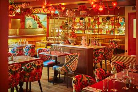
After our initial conversations with the client we got into the design process. We decided to have the 70's Amalfi coast as a guiding star quite early, and was always a storytelling to lean on when forks in the veritable road of design emerged. Tying it up in such a manner offered both a positive limitation and endless amounts of inspiration. The restaurant is designed with three different sections. The customer enters from the outdoor area into the what we reffered to as the 'terrace' in the deisgn process. The terrace is meant to blur the lines between out- and indoor with it's skye-blue roof, plentiful greenery and Onice Giallo Sienna bar. The third section is the cozy dining room. The room is fitted with a roof lantern as connection to the outside, custom made bookshelfs and service stations, a wall mural by Swedish artist Ossian Theselius and a fountain fitted with a ceramic lion's head. The main furnishings in this room sits on an Oak hardwood floor in the middle, with Créma Lune and Verde Guatemala marble fitted diagonaly in the passage ways and around the kitchen. The open kitchen is ever-present, fitted on the restaurant side, with a bespoke bookshelf in a vibrant red hue and filled with Italian books and ornamentation. The visibility into the chefs, hard at work, is meant to bring a connection between the kitchen and the customer. An honesty in process as a representation of Italian cooking. We overall aimed to keep all the materials very real and of highest possible quality with no expenses spared in the fineness of detail. Sweden is quite cold and can be harsch most months of the year and Belmondo is meant to be a 'summer all year', escape from reality, experience for the visitor.